About No Cap
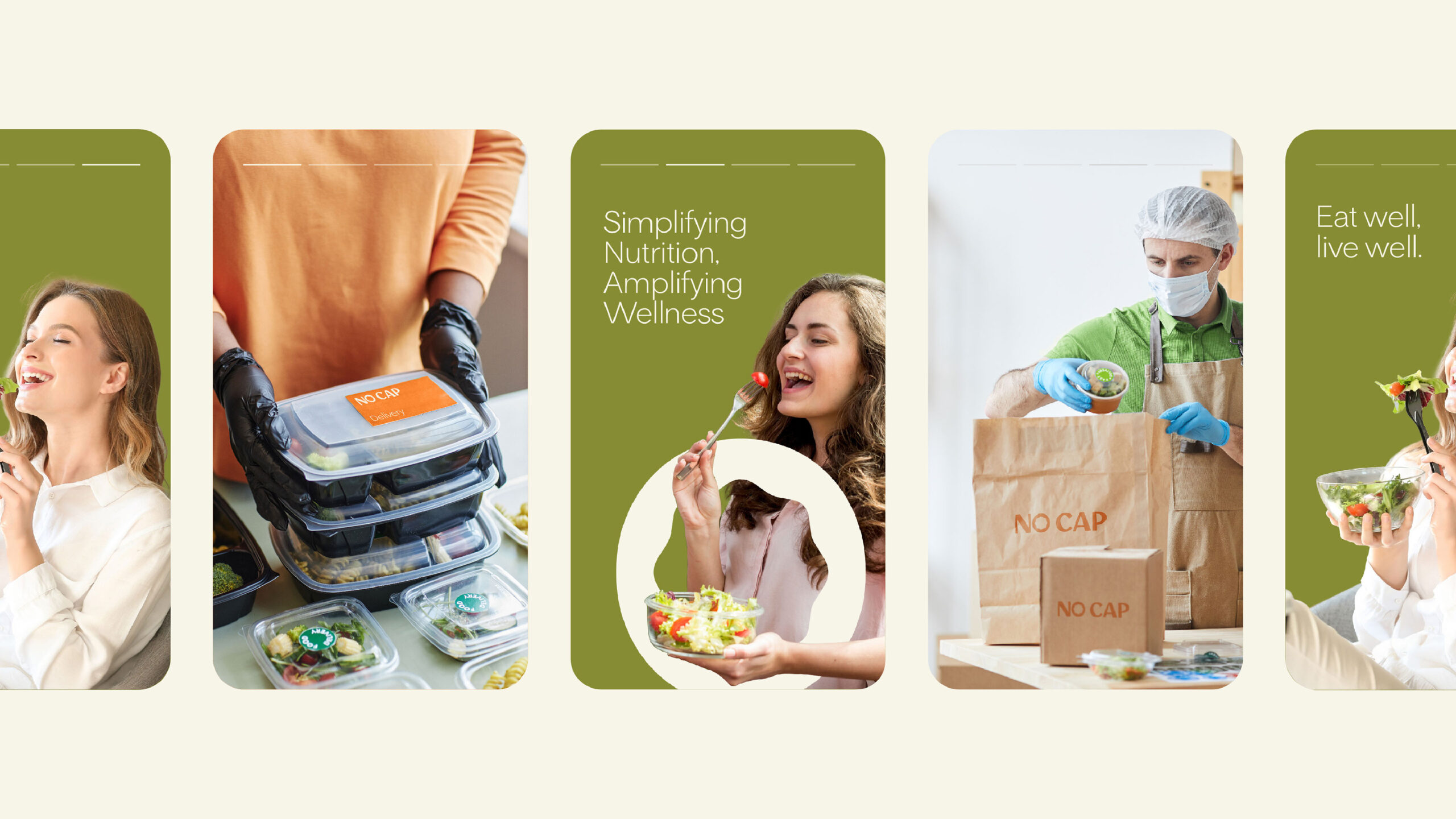
NO CAP, a Canadian brand, has risen to prominence by delivering nutritious meals to its customers. Founded as a small startup, NO CAP prioritizes customer health, reflected in their motto of treating customers well. This means personalized, healthy meals. They are prepared to meet each customer’s needs.
The Concept
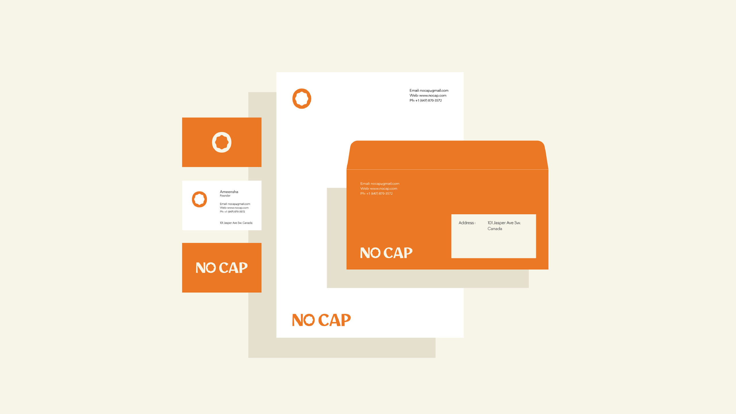
A minimalist logo rich with meaning symbolizes “NO CAP.” The client needed a brand identity for a responsive design. This was a challenge. I had to create a simple, minimal brand identity that would also be responsive. We successfully met this challenge.
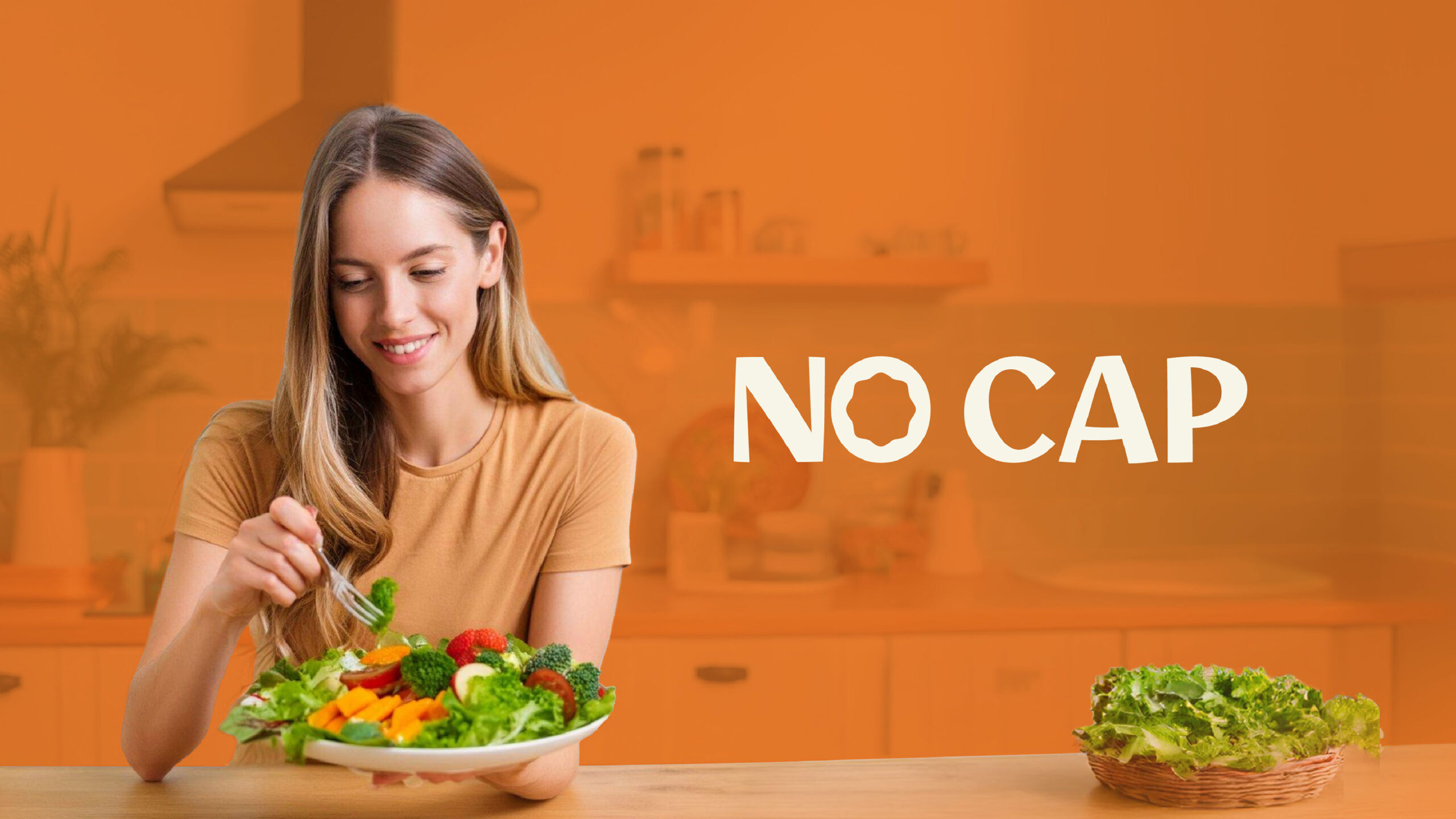
The ‘No cap’ brand identity includes key elements that connect to its purpose. The logo has two closed shapes. The outer shape represents a round table with people seated. The inner ‘O’ looks like broccoli’s curved edges, symbolizing bite-sized food.

